Basic Concepts

Grouping

One or more selectors separated by commas. Grouping allows you to assign styles to multiple elements (selectors). All four heading tags below will be purple.

H1, H2, H3, H5 {color: purple;}
Contextual selectors

One or more selectors delimited by spaces. The example rule indicates the bold markup will be red only while enclosed in H1 tags.

H1 B {color: red;}
     <H1>This is <B>red</B>.</H1>
     <P>This is <B>not</B>.</P>
Class
(tag attribute)

Class selectors may be used as an attribute to a tag. A class selector is a string preceded by a period. Do not use the period when referencing the class. Do not begin a class name with a number, although IE4/5 let you get away with it.

.example {color: red;}
     <P class="example">This is an example in red.</P>
ID
(tag attribute)

ID selectors may be used as an attribute to a tag. An ID selector is a string preceded by a hash mark (#), and is called using the ID= attribute. The hash mark does not appear in the value of ID. Works like the class selector except that the ID can be used only once in the document.

#i5 {color: red;}
     <P ID="i5">This is text with an ID of 'i5'.</P>
Comments

Good idea to leave comments in the style sheet. Affects anything enclosed, even across multiple lines.

/* This is a comment. */
DIV and SPAN tags

These two HTML tags were introduced to support style sheets. Think of them as empty tags which you can fill with styles.

DIV is used for formatting structure, blocks of text.

<DIV style="color:green; font-weight:bold"><H1>This heading</H1></DIV>

SPAN is used for inline formatting.

<P>This is <SPAN class="example">red text</SPAN> in a paragraph</P>
Shorthand syntax

Many properties can accept a shorthand syntax. Values are read from the top clockwise.

Example:
DIV { padding: 5px 10% 0 10% }
is the same as:
DIV { padding-top:5px; padding-right:10%; padding-bottom:0; padding-left:10% }


Units

Length Units

Units of measure take 2-letter abbreviations, with no space between number and unit.
Units fall into three categories:

  • Absolute: mm, cm, in, pt (point size), pc (pica)
  • Relative: em (defining point size of font), ex (x-height of font)
  • Device-dependent: px (pixel)
width: 50px;
margin-left: 2em;
Percentage Units

Used by various properties to define size in relative terms. Values are calculated with regard to their context; in the example, the H2 element will be 75% of its default size.

H2 {font-size: 75% }
Keywords

CSS uses keywords as values for many properties.
Examples are bolder, lighter, larger, x-large, xx-large, x-small.

Color Units

By hex number; by percentage; by name.

color: #FF00FF;    /* note that this may be expressed as #F0F */
color: rgb(100%,0%,100%);
color: chocolate
URLs

Used by various properties to define the location of images. Important: Partial URLs are relative to the style sheet, not the HTML document!

url(picture.gif)
url(http://www.pix.org/lib1/pic278.gif)
list-style-image: url(bullet3.gif)


The Cascade

! important

Style declaration is declared important. Important declarations override all others, regardless of origin or specificity. In CSS2, user will have precedence over author.

H1 {color: maroon ! important;}
Inheritance

Formatting properties of any element are inherited from the element in which it is contained. CSS properties always have some value, even if not specified by the author. This can be used to minimize style markup but can be the source of unpleasant surprises since each browser may give slightly different initial values to properties.

Link External Style Sheet

The external style sheet is the means to control the look of many pages at once. Use the LINK tag in the HEAD of your page.

Example: <LINK REL="STYLESHEET" TYPE="text/css" HREF="demo.css">

Cascading Order and Style Syntax

Precedence is from the most specific to the most general. The closer a style is to the element being styled, the more priority it has. The order from highest to lowest:

  1. STYLE="blah blah" inline attribute to a tag
    Example: <P STYLE="color: red; font-family: 'Times New Roman', serif">inline</P>
    Note the single quotes around the font name to avoid conflict with double quotes.
  2. <STYLE> tag in HEAD of document
    Example:
    <STYLE>
    .title { font-family: 'Snap ITC', cursive;
    font-size: 120%;}
    </STYLE>

    The styles of the STYLE tag should be placed after any referenced external stylesheets.

  3. <LINK> to external style sheet in HEAD of document
    Example: <LINK REL="stylesheet" TYPE="text/css" HREF="demo.css">
  4. Browser default styles
Media

Technically part of CSS-2, you can specify different styles for online display and print. A common use is to specify items not to appear on screen or not to print.

<STYLE media="print">      /* print version styles here */
.noprint {display: none;}  /* items with this class won't print */
</STYLE>

<STYLE media="screen">     /* screen version styles go here */
.noshow {display:none;}    /* items with this class won't appear on screen */
</STYLE>


Font Properties

font-family

Used to declare specific font to be used, or a generic font family in order of preference.
The generic families are: serif, sans-serif, monospace, cursive and fantasy. They must not have quotes around them. Multiword font names should have quotes to avoid confusion.

P {font-family: "Times New Roman", serif;}
font-style

Selects between italic and normal.

EM {font-style: italic;}
font-variant

Currently has two values: small-caps and normal. Likely to acquire more values in the future.

H3 {font-variant: small-caps;}
font-weight

Values are: bold, normal, lighter, bolder and numeric values 100-900.

B {font-weight: 700;}
font-size

Sets the absolute size (pt, in, cm, px), relative size (em, ex), or percentage of normal size.
Keywords: xx-large, x-large, large, medium, small, x-small, xx-small, larger, smaller

H2 {font-size: 200%;}
H3 {font-size: 36pt;}
font

Shorthand property for the other font properties. The order of values is important, and is as follows:
font {font-style font-variant font-weight font-size/line-height font-family;}. Any of these values may be omitted but order is important.

P {font: bold 12pt/14pt Helvetica,sans-serif;}


Color and Background Properties

color

Sets the color of a given element. For text, this sets the text color; for other elements, such as HR, it sets the foreground color.

H6 {color: green;}
background-color

Sets the background color of an element. Background extends to the edge of the element's border. Initial value: transparent.

{ background-color: #CCCC00 } 
background-image

Sets an image to be the background pattern. In conjunction with the other background properties, the image may tile or repeat in one direction only. Recommend using with background-color to allow for users who disable image loading.

BODY {background-image: url(bg41.gif);}
background-repeat

Sets the repeat style for a background image. Values are: repeat (tile), no-repeat, repeat-x (horizontal), repeat-y (vertical). Default: repeat.

BODY { background-repeat: repeat-y }
background-attachment

Defines whether or not the background image scrolls with the element. Values are: scroll and fixed.

BODY {background-attachment: fixed;}
background-position

Sets the starting position of the background color or image. If a color, the color fill continues from the set position. If an image, the first image is placed at the set position. Values: Position (x y) or (x% y%); top, center, bottom, left, right.

BODY {background-position: top center;}
background

Shorthand property for the other background properties. The values can be written in any order.

BODY {background: white url(bg41.gif) fixed center;}


Text Properties

letter-spacing

Sets the amount of white space between letters, which are defined as any displayed character .

P {letter-spacing: 0.5em;}
line-height

Sets the vertical distance between baselines in an element. Negative values are not permitted.

P {line-height: 18pt;}
H2 {line-height: 200%;}
text-decoration

Values are: none, underline, overline, line-through, blink . Combinations of the values are legal.

U {text-decoration: underline;}
.old {text-decoration: line-through;}
text-transform

Changes the case of the letters in the element, regardless of the original text. Values are: capitalize (capitalizes first letter of each word), uppercase, lowercase.

H1 {text-transform: uppercase;}
text-align

Sets the horizontal alignment of the text in an element. May only be applied to block-level elements.

P {text-align: justify;}
H4 {text-align: center;}
text-indent

Sets the indentation of the first line in an element. Most often used to create a tab effect for paragraphs. Only applies to block-level elements; negative values are permitted.

P {text-indent: 5em;}
H2 {text-indent: -25px;}
vertical-align

Determines the alignment of text within a line or within a table cell; Keywords: baseline; middle; sub; super; top; text-top; bottom; text-bottom.

.super {vertical-align: super;}
word-spacing

Sets the amount of white space between words, which are defined as strings of characters surrounded by white space.

P {word-spacing: 0.5em;}


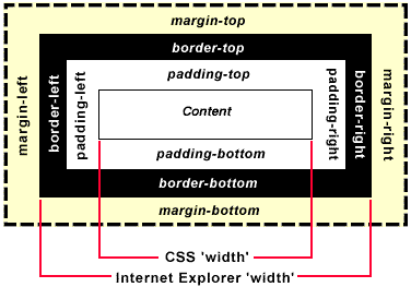
  CSS Puts Everything in a Box

The Box Model

The most powerful way of thinking about style is to consider every element (<P>, <H1>,etc.) as a box. The dimensions of the box can be controlled to produce a very broad range of effects.

If you think of a page as a box of boxes, this model forms the basis of positioning elements even to the pixel level.

Note that as of IE6.0, that browser now follows the W3C definition for width, which should not include border and padding values.


Box Model (simplified)


Box Properties

margin-top

Sets the size of the top margin of an element. Negative values are permitted, but exercise caution. Negative margins not handled well by Netscape 4!

UL {margin-top: 0.5in;}
margin-right

Sets the size of the right margin of an element. Negative values are permitted, but exercise caution.

IMG {margin-right: 30px;}
margin-bottom

Sets the size of the bottom margin of an element. Negative values are permitted, but exercise caution.

UL {margin-bottom: 0.5in;}
margin-left

Sets the size of the left margin of an element. Negative values are permitted, but exercise caution.

P {margin-left: 3em;}
margin

Sets the size of the overall margin of an element. Negative values are permitted, but exercise caution. Multiple values start from the top and go clockwise.

H1 {margin: 2em;}
P {0% 5% 0% 5%;} 
padding-top

Sets the size of the top padding of an element, which will inherit the element's background. Negative values are not permitted.

UL {padding-top: 0.5in;}
padding-right

Sets the size of the right padding of an element, which will inherit the element's background. Negative values are not permitted.

IMG {padding-right: 30px;}
padding-bottom

Sets the size of the bottom padding of an element, which will inherit the element's background. Negative values are not permitted.

UL {padding-bottom: 0.5in;}
padding-left

Sets the size of the left padding of an element, which will inherit the element's background. Negative values are not permitted.

P {padding-left: 3em;}
padding

Sets the size of the overall padding of an element, which will inherit the element's background. Negative values are not permitted.

H1 {padding: 2ex;}


Box Properties (cont.)

border-top-width

Sets the width of the top border of an element, which will inherit the element's background, and may have a foreground of its own (see border-style). Negative values are not permitted.

UL {border-top-width: 0.5in;}
border-right-width

Sets the width of the right border of an element, which will inherit the element's background, and may have a foreground of its own (see border-style). Negative values are not permitted.

IMG {border-right-width: 30px;}
border-bottom-width

Sets the width of the bottom border of an element, which will inherit the element's background, and may have a foreground of its own (see border-style). Negative values are not permitted.

UL {border-bottom-width: 0.5in;}
border-left-width

Sets the width of the left border of an element, which will inherit the element's background, and may have a foreground of its own (see border-style). Negative values are not permitted.

P {border-left-width: 3em;}
border-width

Sets the width of the overall border of an element, which will inherit the element's background, and may have a foreground of its own (see border-style). Negative values are not permitted.

H1 {border-width: 2ex;}
border-color

Sets the color of the border of an element. In the example, top and bottom borders are silver, left and right are black. All 4 borders may be separately set.

H1 {border-color: silver black;}
border-style

Sets the style of the overall border of an element. Values: dashed; dotted; double; groove; inset; outset; ridge; solid; none. Default: none (border not displayed).

H1 {border-style: solid; border-color: purple;}


Box Properties (cont.)

border-top

Shorthand property which defines the width, color, and style of the top border of an element.

UL {border-top: 0.5in solid black;}
border-right

Shorthand property which defines the width, color, and style of the right border of an element.

IMG {border-right: 30px dotted blue;}
border-bottom

Shorthand property which defines the width, color, and style of the bottom border of an element.

UL {border-bottom: 0.5in grooved green;}
border-left

Shorthand property which defines the width, color, and style of the left border of an element.

P {border-left: 3em solid gray;}
border

Shorthand property which defines the width, color, and style of the overall border of an element.

H1 {border: 2px dashed tan;}
width

Used to set the width of an element. Can be used on any block-level or replaced element. Negative values are not permitted.

TABLE {width: 80%;}
height

Used to set the height of an element. Can be used on any block-level or replaced element, within limits. Negative values are not permitted.

IMG.icon {height: 50px;}
float

Causes the element to float to one side and other text to wrap around it. Use it for non-positioned block elements. Values: left; right; none.

IMG {float: left;}
clear

Specifies whether the element can have floating elements around it. Causes the element to be positioned below any floating elements on the side specified. Values: both; left; right; none. Default is none.

H1 {clear: both;}


Classification Properties

display

Used to override default formatting for HTML elements. Values: block; inline; list-item; none. Default is block. Note that space is not reserved for the element when display = none. (See Positioning Property: visibility.)

.hide {display: none;}
white-space

Defines how whitespace within the element is treated. Values: normal, pre, nowrap.

TD {white-space: nowrap;}
TT {white-space: pre;}
list-style-type

Used to declare the type of bullet or numbering to be used in an unordered or ordered list. Values: disc; circle; square; decimal; lower-roman; upper-roman; lower-alpha; upper-alpha; none.

UL {list-style-type: square;}
OL {list-style-type: lower-roman;}
list-style-image

Used to declare an image to be used as the bullet in an unordered or ordered list. Applies to elements with a display value of list-item.

UL {list-style-image: url(bullet3.gif);}
list-style-position

Used to declare the position of the bullet or number in a list with respect to the content of the list item. Values: inside; outside. Default: outside.

LI {list-style-position: inside;}
list-style

Shorthand property condensing all other list-style properties. Applies to all elements with a display value of list-item.

UL {list-style: square url(bullet3.gif) outer;}


Positioning Properties

left

Specifies the left position of an element positioned relatively or absolutely. Values: auto or length values (pt, in, cm, px) or percentage. Negative values permitted.

{ left: 2% } 
top

Specifies the top position of an element positioned relatively or absolutely. Values: auto or length values (pt, in, cm, px) or percentage. Negative values permitted.

{ top: -20px } 
overflow

Specifies how content which overflows its box is to be handled. Values: visible (display content); hidden (hide overflow content); scroll (provide scrolling mechanism); auto (up to the browser to figure out what to do)

{ overflow: auto } 
position

Specifies whether the element can be positioned. Values: static (default--not positioned); relative (in relation to where the element would normally be); absolute (in relation to the top left hand corner of the parent element).

{ position: relative } 
visibility

Specifies whether element is visible. Note that space for element is reserved in either case. (see Classification Property: display) Values: visible; hidden.

{ visibility: hidden }
z-index

Specifies whether an element is displayed above or below overlapping elements. Values: auto (stack on page in order element appears in code); or an integer. Elements with higher numbers are on top of those with lower.

{ z-index: 2 }
clip

Specifies an area of an *absolutely positioned* element to be rendered transparent. Values: rect (top right bottom left) where top right bottom left are auto or length values (pt, in, cm, px). The value given for clip only applies if overflow is set to something other than visible. Beware, Internet Explorer has a completely different definition of clip. Yes, this is confusing!

p.framed { clip: rect (2em auto auto auto) } 


Pseudo-Classes and Pseudo-Elements

anchor

Pseudo-classes can be used in contextual selectors and can be combined with normal classes.

A:link {color: #900}
A:link IMG { border: solid blue }
A:hover { background:#ffff00; } 
A:visited {}
A:active {} /* style visible only at moment of click */ 

Combining pseudos: Normal class names precede pseudos in the selector.

A.external:link { color: magenta }
<A CLASS="external" HREF="http://out.side/">external link</A>
first-line

Applied to the first displayed line of text in the given element. This persists even if the text is reformatted. Applied to block-level elements only. Supported by IE5.5 and Opera 3.6.

P:first-line {color: red;}
     <P>The first line of this paragraph is
red. More blah blah blah...</P>
first-letter

Applied to the first letter in the given element. Can be used to generate drop-cap effects, among others. Should be applied to block-level elements only. Supported by IE5.5 and Opera 3.6.

P:first-letter {color: red;}
     <P>The capital 'T' at the beginning of this paragraph is red.</P>


Printing Properties

page-break-after

Printing properties currently work partially with IE4 and more fully with IE5 and Opera 3.5. CSS2 will greatly augment single-source strategies for documenters.
Values:
auto do a page break after the element only if there is no remaining space on the current page
always always do a page break after the element
left do one or two page breaks after the element until a blank left page is reached
right do one or two page breaks after the element until a blank right page is reached

Example:
 
<STYLE>
.page {page-break-after: always}
</STYLE>
...
<P CLASS="page">
... 
page-break-before

Values: same as above. Note that neither of these properties work within tables. Also buggy used with <br> tag. Recommend using page breaks in structural tags (H1, P, DIV, etc.).

If there are conflicts between the two page-break properties, the value that results in the largest number of page breaks will be used.


Miscellaneous

cursor  

Specifies the appearance of the cursor when placed within an element.

Values: auto (browser determines based on context); crosshair; default (usually an arrow - determined by operating system); help; move; pointer; text; wait; e-resize; ne-resize; nw-resize; n-resize; se-resize; sw-resize; s-resize; w-resize.
Use 'hand' to force the hand cursor, which works for IE4, IE5, and Opera 3.5 although not part of the W3C specs. For most other browsers, 'pointer' will display the hand cursor.

{ cursor: help }